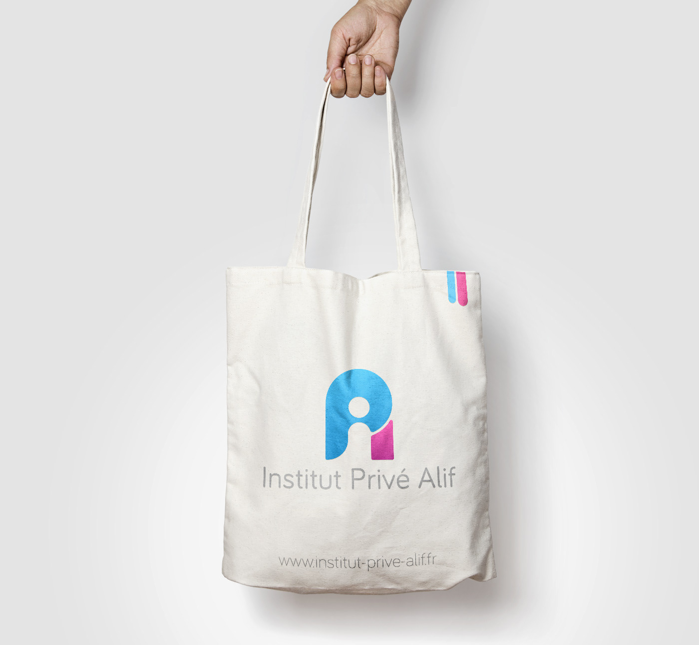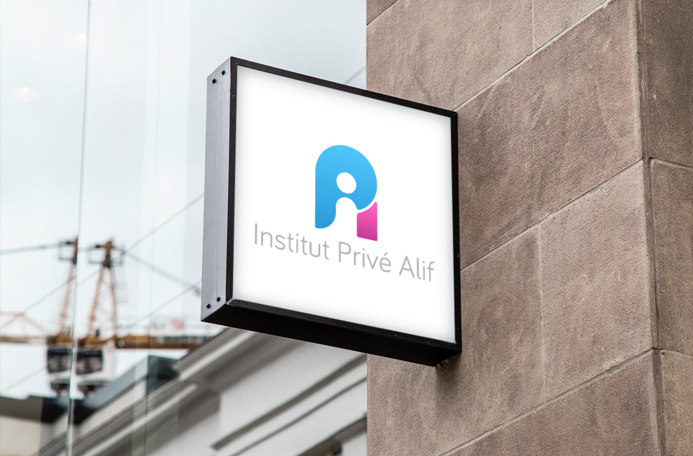
Creation of IPA's visual identity
The "Institut Privé Alif" is a private secondary school. After changing its name, the institute aims to rethink its image and its visual identity in order to mordernize them.
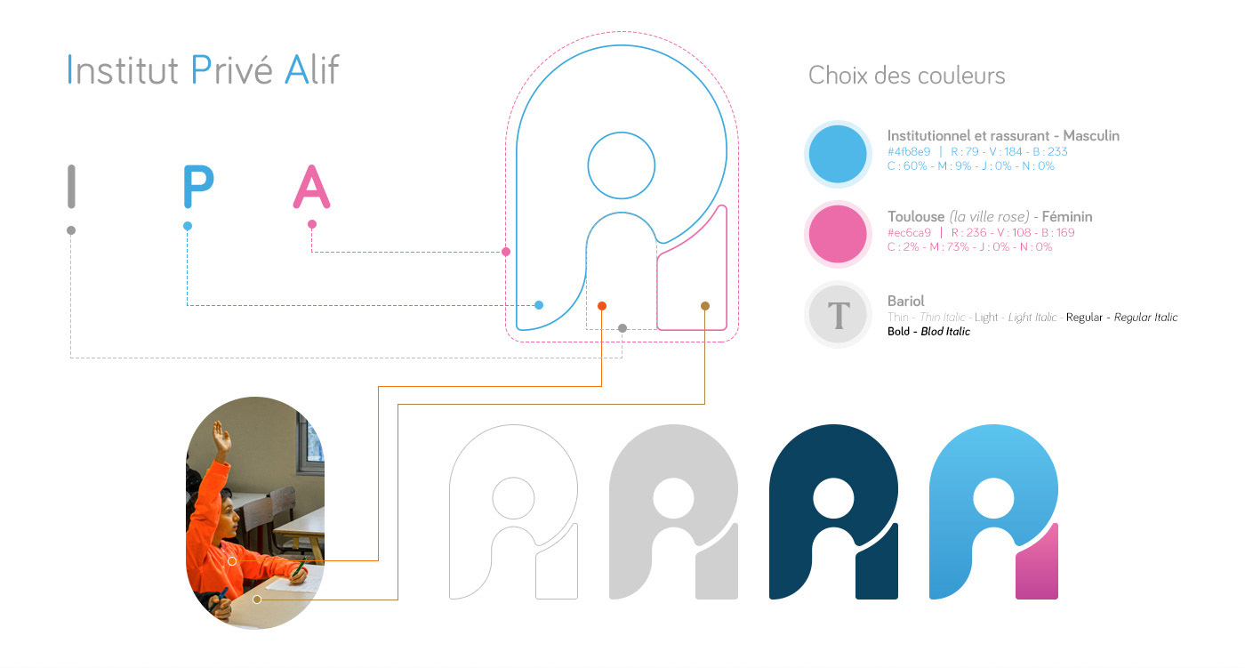
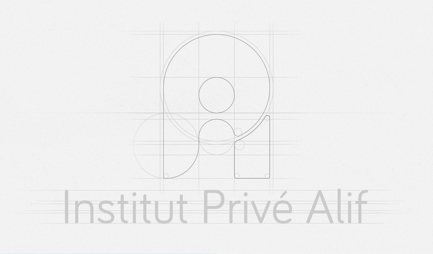
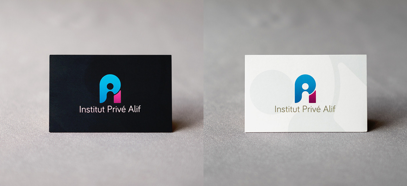
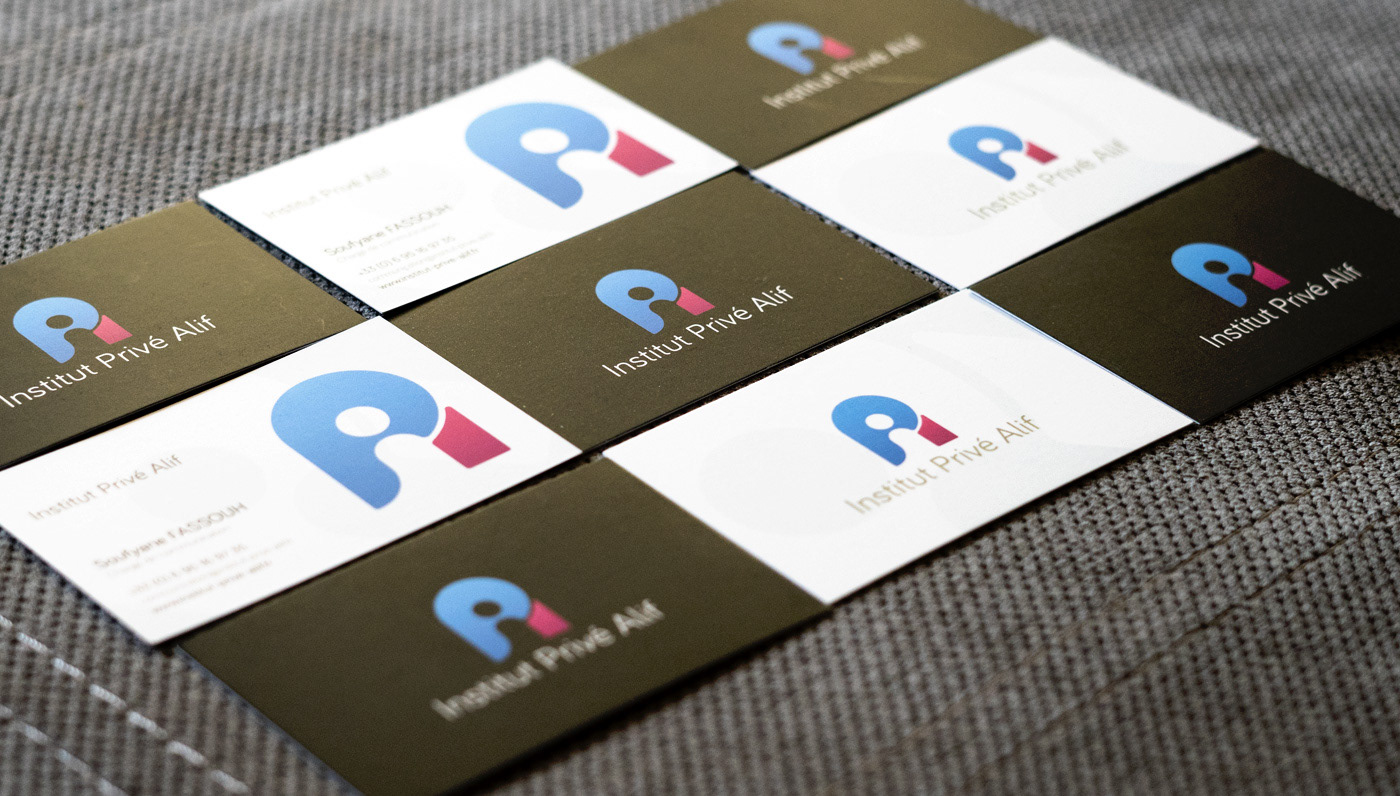
The prerequisite was to keep the three letters "IPA" (Institut Privé Alif) in the logo, therefore I explored several possibilities before chosing this one. The full logo has the shape of an 'A'for "Alif" (first letter of the Arabic alphabet), because it is the historical name of the institute. In blue, the letter 'P' for "Privé", and in the middle, the empty space from the letter 'A' stands for the letter 'I' for "Institut".
The letter 'I' also illustrates a student over its desk (in pink), participating in class.
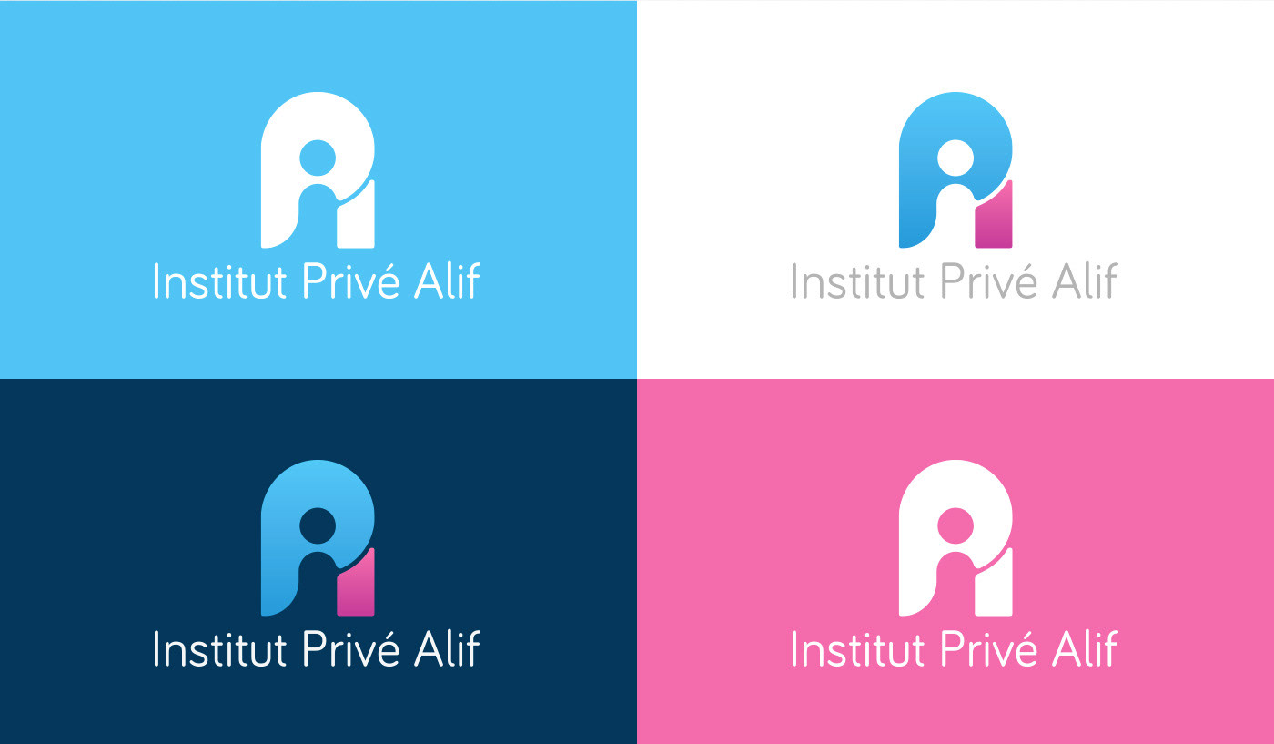
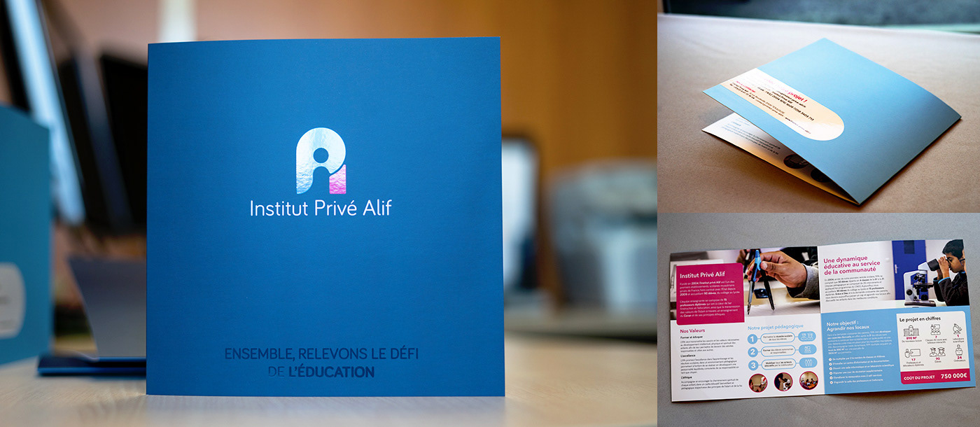
The objective of this logo is to embody the renewal and also affirm the essential role of IPA. Sober and innovative, it represents in a stylized form the three first letters of the acronyme IPA. The blue color gives it some institutional touch while the pink is a reference to the city of Toulouse whose pink color from the bricks has become its emblematic color, just as IPA does in the toulousan educational landscape.