Drisselec is a family-owned general electricity company. Created in 2008 in Toulouse, the company is growing. Aware that she can not continue to grow without taking care of her communication. they therefore appealed to our agency to redefine their new visual identity.
After several exchanges with them, we analyzed the needs. Subsequently, we tested several creative leads and propose a strong identity adapted to the company's activities.
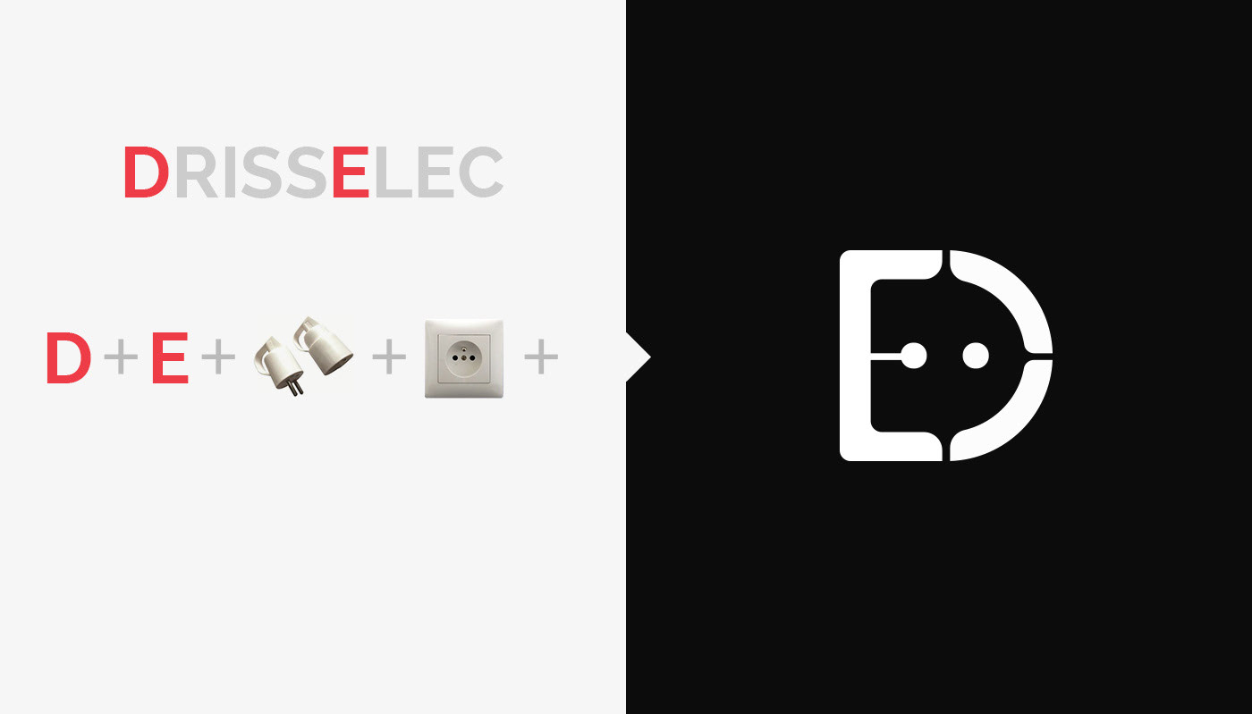
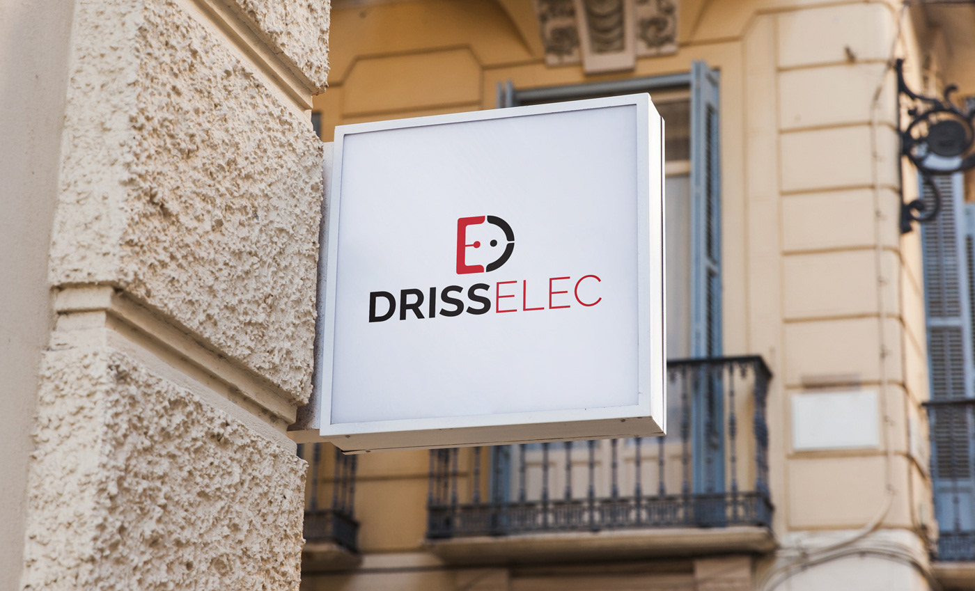
In order not to fall into the already seen, such as lightning for example, which is often used to represent this area of activity, we chose a creation track mixing the main letters of the name "DRISSELEC" (DE) in order to form an electrical outlet that symbolizes electricity (see the approach in the picture below). Thus, the letter-shaped logo D (for DRISSELEC) represents the letter E for ELEC and "electricity" and contrasts a socket and a wall socket.